Google Maps Blue Dot

Resolving the My Location “Blue Dot” in Google Maps
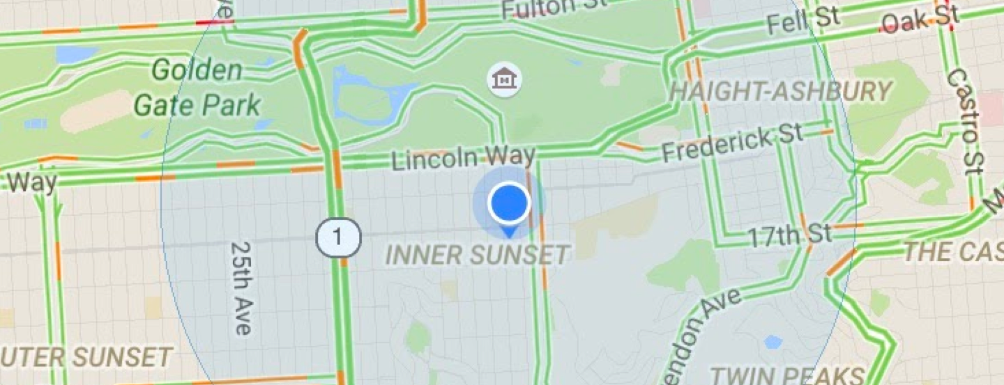
The “blue dot” in Google Maps, also known as “My Location,” is a critical component of the Maps UI to help users orient and navigate in their current environment. When problems with the blue dot became one of the most common user-reported issues in the Maps mobile app, we formed a multi-disciplinary team of engineers from Android, Maps, and Location Quality, plus myself representing UX Research, to identify the cause of these complaints and find solutions. Many technical issues can cause problems with a users’ mobile device location quality, but since feedback from users was vague, lacking screenshots or desired location information, and often laden with anger and exasperation, we first needed to understand which types of problems were most common and which caused the most user frustration.

Methods
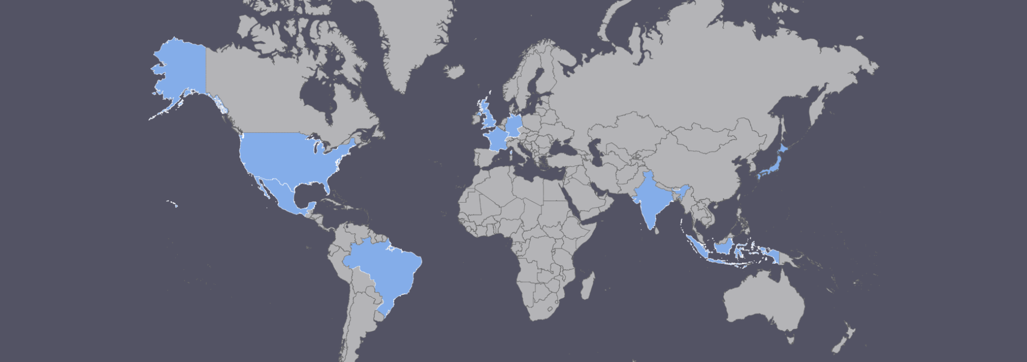
We conducted a series of 4 in-product satisfaction surveys across 9 countries and 23,000 users to assess base-rates of blue dot satisfaction and identify common types of problems. We also ran a series of general surveys of over 2,000 Android users to understand people’s interpretations of the UIs depicting the blue dot, compass arrowhead, and navigation chevron.

Insights
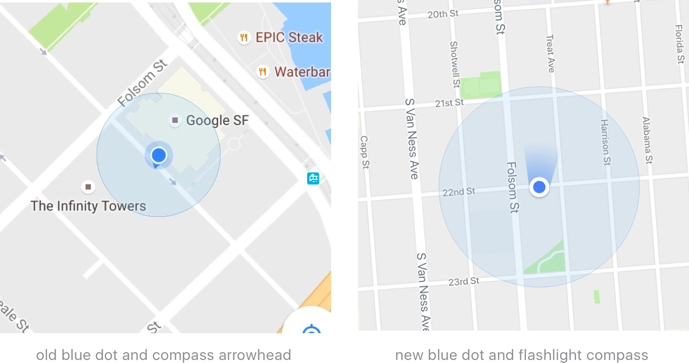
We found that especially in the US, people were actually quite satisfied with the blue dot and the quality of their current location, but in other countries satisfaction dipped and users reported different types of problems specific to each country. We also learned that many issues were related to users’ confusion around the orientation of the compass arrowhead, a UI that is supposed to indicate what direction the phone is pointing but many assumed was for navigation and direction of movement.

Outcomes
The engineering teams focused efforts on improving accuracy, latency, and jumpiness, the three most frustrating issues identified in user surveys. The design team iterated on new ways of visualizing the expected accuracy of the blue dot and the orientation of the compass (direction the phone is pointed), which were the most commonly reported points of confusion and misunderstanding. By surveying a broad spectrum of users who could report on problems in-context while using the app, we were able to identify the most important design and engineering issues to solve, resulting in a much improved experience for all our users.

My role
Lead UX Researcher and main UX representative on the project; collaborated with designers to ideate design solutions for blue dot and compass UI improvements.